Monday, August 31, 2009

Always darkest before the dawn

Essay Guidelines COLOR AND DESIGN THEORY

For those of you who did not receive the handout passed out in class, here are the G-lines:

Read the short essay on David Ireland by Greg Borman
Consider the following questions.  Apply your discoveries to your essay due 9/03.

How does Borman begin the essay?
What does Borman write about in the middle of his essay and how does he conclude?
How does the author introduce the exhibition, the main subject fo the essay?
What does the author think Ireland is doing in constructing his sculptures and installations?

Key Points to remember:
Include the gallery, artist’s name, title of work, year, materials used in the introductory
paragraph.

Include a bibliography of at least 2 sources. Site your source properly. Failure to do so
may appear as plagiarism.*

Describe what you see.

Imagine you are writing this essay to someone who has not seen the art.

You must discuss the work in terms of the Principles and Elements of Design.

The words “I like” should not be included in your essay.

Just by choosing to write about the art, it is clear that you find it interesting, therefore it is
more important that you explain WHY you find it appealing, strange, beautiful, etc.

EVERYONE MUST VISIT THE IDEA CENTER TO HAVE THEIR ESSAY REVIEWED.
FAILURE TO DO SO WILL RESULT IN AN INCOMPLETE FOR THE ASSIGNMENT.
*PLAGIARISM WILL NOT BE TOLERATED AND WILL RESULT IN AN F.

Friday, August 28, 2009

Alert! Important Developments

I am aware that my mailbox was full yesterday! Do not panic. I will accept the electronic copy through the weekend.
Sometimes email can be persnickety BUT submiting digital portfolios is a very common practice in art and design these days.
I usually BCC myself (send a blind copy of the file to my own email) to test that the file is going through. Then if it is bounced I know the problem is not at my end.

Also I realized that many of you may not be able to burn your songs to disk because they exist as this or that file.
Just bring your portable music devise to class on the day of your presentation and be ready to cue it up. Practice.
You do not want to spend 5 minutes searching your player to find the songs you need. A presentation is like a dance.


Or it's like stand-up comedy. Timing is everything.

Thursday, August 27, 2009

#1. Scan Art Review

Hi
Sorry I can't be with you today.


Feeling a little under the weather


Please follow Ms Binders instructions.
I will be back next week when our activities will include a Collaborative Sculpture.
Please bring to class 3 objects about the size of your fist that represent a single color scheme like achromatic, complimentary, analogous, etc.

Today you'll have a full class beginning with a peer review of the scan art project.  Please put your hard copies on your desk, leave your places and look at the work around the room.  Find a project that catches your attention.  It doesn't need to be the 'Best', it could be unusual, strange, mysterious.  Then look at worksheet #1 and answer the question.

#2. Final project guidelines and deadlines!

First let's see the deadlines again:

Next class, 9/3 your essays and the art work for your final projects are due!
Please be prepared to submit a hard copy and a digital copy of your artwork, just like
the scan art project that is due today.  Reminder, your essays need to be reviewed by the
IDEA CENTER staff before you complete the final draft.


I found this great site, maybe some of you have seen it.  Not only are there lot's of cool
album covers but good articles on the art form and the designers.  Check it out! 


Guidelines:

Final Project “Mixed Tape” Cover Art

Use your developing knowledge of Color and Design Theory to produce a unique and effective
design for a mini mixed tape (CD actually).


Requirements:

Final Project due 9/3, consisting of a CD containing 4-6 songs of your choosing, not necessarily
by the same artist(s) and corresponding cover art, plus a typed 250 word project description.


Dimensions for cover art must be square. Actual size of a CD is 4.75 x 4.75 but your copy can be larger.  Most of us see cover art digitally now so the size can vary but the proportions should not.  On the due date, submit a hard copy and a digital copy of your project.


wow...can you see that?

The project description must describe how your design will effectively market the anthology.
This is your pitch to the hiring committee. You want to impress them with your knowledge of
Design language, as well as your knowledge and understanding of successful
trends in album cover art design. 

On the last day of class, you will play a few moments from the CD and give an oral presentation addressing the effectiveness of your design and how it will enhance the overall performance of the music project.  Be prepared to talk about your work for 3-5 minutes, with an question answer period at the end of each presentation.

Over the weekend you have created 6 concept sketches or thumbnails drawings, showing several designs and a few variations on those designs. In addition to the concept sketches,you should have at least 2 color schemes and  two types of media which you are interested in using
in this project. Compile your sketches, color schemes, media choices in an organized manner.
You will share these with your classmates shortly.

After sharing your work with your peers you will decide on a final design and title for your project.  Once that has happened, you will have open lab time.  You may choose to work at your desk, go to the library or the galleries.  There are handouts to be filled out for each activity and the entire booklet must be turned in at the end of class for credit.

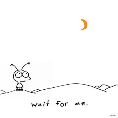
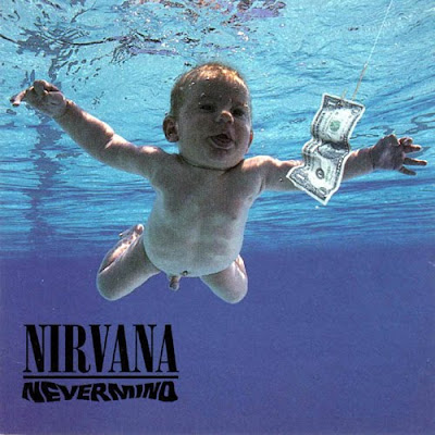
Let's look at some cover art to get inspired.


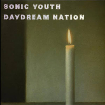
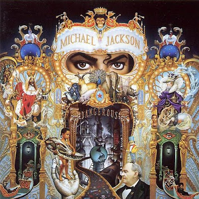
According to the designer, when this album came out, the late 1980's, things were pretty dismal politically, with Reagan as president and the cold war threatening nuclear annihilation. The candle symbolized hope. Hey, do you know that this is a painting. You've seen the artists work before in this class.


Gerhard Richter

Art and design always mixing it up.


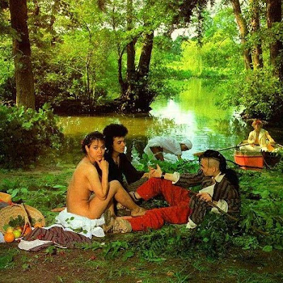
Here's some cover art from a Bow-Wow-Wow album, another 80's band. Some of you might know
their cover to "I want candy!"


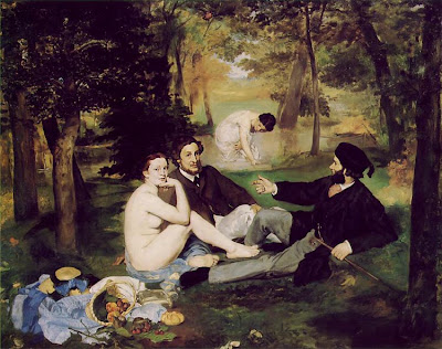
The design was inspired by Edouard Manet's Luncheon on the Grass, 1863, a rather controversial painting for it's time. Observe how odd the perspective is and the way the woman boldly looks into the eyes of the viewer. Groundbreaking.


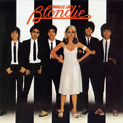
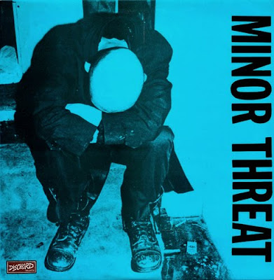
Strong design, almost achromatic color scheme and very balanced.


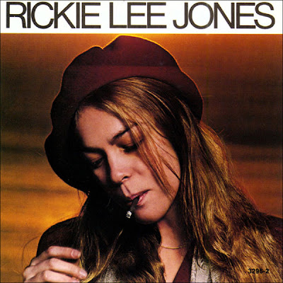
Warm, monochromatic color scheme sure sets a mellow mood.


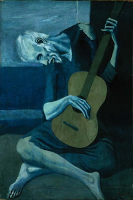
Reminds us of Picasso's blue-period!


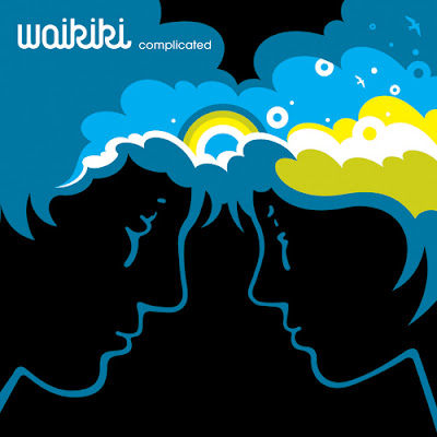
Symmetrically balanced, with a nice twist.


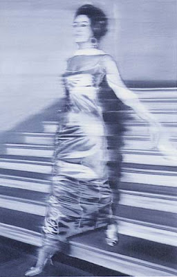
Soooo 80's!  Cover art by Patrick Nagel


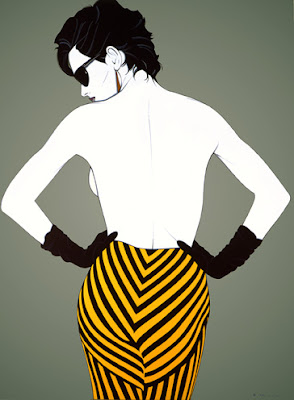
Fine art by Patrick Nagel


Notice how the black background really makes the colors POP!
It maximizes color intensity.


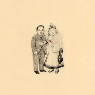
Notice the little spot of blood on the brides dress. Very mysterious. Makes one want to take another, closer look.
And the scale is rather odd. Another intriguing touch.

Now get to work!
First take a look at your own work and fill out the self-evaluation worksheet.
Then move on to the Peer Review worksheet.


#3 Presentation Guide

Your presentation should include the following:

Presentation Guidelines

A good presentation must be planned.
A good presentation does NOT mean reading your statement.
A good presentation should appear natural, like you were born with it.

Tips:
Rehearse you presentation several times. You might find different ways to say something. You might find that the order of your statements should change to feel more natural. Rehearsing out loud gives you a real sense of what your ideas sound like. “Wow, I’m brilliant or gee that sounds a bit off the wall.” Better yet, perform your presentation in front of a friend (who will give you an honest opinion). They may have some ideas on how to improve your delivery.
Get enough food water and sleep. You want to feel strong and focused.
Wear something nice. You want to appear professional and feel confident.


Requirements:
Be prepared to play about 30 seconds of your music selections.
An image of your artwork/design will be projected on the white board.
Begin your presentation with a concise and direct statement describing your design concept. Use Color & Design Theory vocabulary for optimum points. Discuss your idea more in depth and how it relates to the music. Discuss how you’ve created an effective, appealing design. Discuss the media you’ve used, a little about the technique you used to create the design and give a shout-out to your sources and inspiration.
Remember, this project is about visual communications. The music is secondary to your design. Be prepared to defend your idea during the question answer period.


Presentations will take place September 10th, our last day of class.
Next week 09/03/09 your final artwork is DUE. Remember to provide me with a hard copy (a xerox or the actual artwork) and a digital copy so I can project it during your presentation. You may have time next week to scan but be warned, the computers could be very crowded! Plus your artist essays (proofed by the IDEA CENTER) are DUE.

Thursday, August 20, 2009

final project: Album Cover Art

For your final project you will create a mini-LP, consisting of 4-6 songs and an appropriate design for your mini-LP album cover.

Steps:


Today go to the library and conduct research individually or in groups to answer the following questions:

Who makes album art?

What media do designers use in creating album art? (hand drawing, computer illustration, photography, etc)?  Identify 3 different examples and describe the media used in the design.
Look in books, magazines, on the web for your source material.

!more to come!

Wednesday, August 12, 2009

Assignment #5 Scanner Art

Objective: Using your knowledge of design and color theory, create an abstract self-portrait on a flatbed scanner, focusing on texture, color and value contrast.


Guidelines:


Using objects and materials from home, or from the library swatch room, create composition on a flatbed scanner.  Scan construction and save. Adjust manually until your happy with arrangements.  Adjust further in Photoshop if desired, and print (good to high quality). Save your project to disc or to a jump drive.  The saved document must be submitted to the instructor along with the paper hard copy. 

Tips and Techniques:

Choose at least 3 objects/material swatches.
Consider adding a background to unify the arrangement or scan as-is.
Experiment with flat and volumetric objects to see how they scan.
Consider using text, flowers, boxes, crumpled up bags, items with distinct and
interesting texture, color and value contrast.  Look at the following examples for
inspiration.

Execution must be designer-level, mature and professional.

150 points

Due 8/20 Six "mock-ups" of texture scan project.  These can be smaller prints.  Do not mount on matboard. PLUS this is the last day to re-submit assignments.

Due 8/27  Final version of texture scan saved to disc.  Include one color hard copy on regular printer paper plus a statement describing how you've used texture, color and value to create an effective composition.  


Look at the examples below. Some are done by
professional artists and others by former students.


Project #6 is almost ready for it's close-up. Check out this great website for inspiration.